A few months ago I adopted a Jindo Dog that I named Keiko-Xiong.
I have to admit that having a dog has really made my home life so much happier. Although I still think it was a brief moment of insanity that made me go and adopt Keiko... I'm happy I did.
She was extremely insecure, shy and would shake visibly when I came near her. Her first three days in my condo was spent huddled in corner behind my coffee table.
My previous dog, Britta Bean, had also been a rescue and shared some of the same skittish behaviour. Britta was a 3 year old Rottweiler that had been found on the side of the road by a woman (who I swear is an angel on earth) named Helen Garcia who ran Rotts Across Texas. If I were to be put into dog-form, I think I would have been very close to Britta Bean (we shared the same personality). It was almost this innate understanding of what Britta was thinking that helped us work through her issues and I loved her very much. However, Keiko was very different from Britta... and I was a little worried I wouldn't be able to help her integrate into my house at all.
I wanted to make sure that I was able to read and communicate with Keiko and without the "love at first sight" intuition that I had with Britta Bean... I decided to learn as much as I could about dog-language.
I had a few things in my advantage.
This was excellent news because there are a LOT of studies about Wolf Behaviour that is accessible.
The most interesting was about Wolf Body Language-- a particularly helpful site was from a page hosted by
Kim Miles and also by
Karlyn Atkinson Berg's site on Timberwolves.
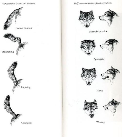
Both sites talked about reading body language through, face, ears, tail, and body position.
 |
| Tail and Face Click on photo for source (used Google Search) |
Having Keiko have so many wolf characteristics gave me more concrete examples to pull from, which was nice. This was unlike Britta Bean who had floppy ears and a docked tail (almost 70% of the visual queues were missing).
 |
| In this picture this is her Happy- Focused face. Nothing in the world would pull her focus from us. She could only get like this if she was alone with me or my roommate and there was nothing potentially threatening around us. |
So, with all of this information I started to apply these to Keiko.
/*This started out for me wanting to see if she was improving. I had the option to take her back to the rescue group in case she didn't work out. Although I was sure that I would keep her no matter, my living situation was a complete 180 from where she was used to living before. If she wasn't able to make the transition... then I didn't want to subject her to living with me and would rather the rescue group find her a better suited home. It ended up becoming a complicated study which I am now sharing. */
To do this I had to know what to look for and watch and what situations there were.
I needed to observe the situational factors and the outputs (what Keiko was telling me-- and since she can't talk--- I had to use body language).
Some assumptions I made:
- Dogs react to the situation they are in and aware of. This means that the inputs of the system could be directly observed by monitoring the external situation. I made the assumption that there are no inputs that are motivated internally by the dog (although this assumption needs more exploring, this key premise makes the analysis much simpler, please see *processing communication blog post to understand the complexity should I change this.)
- There are pre-determine ways a dog reacts to external situations and will react the same way to every situation if it is similar. (dogs won't change their base processes). The only way to change this reaction is by training or changing the situation.
- Dogs have no hidden processes. If there is a change in the dog's body language then there was an external situation stimulus. If there is a change in external stimulation there should be a change in body language.
- Dogs will output an action and provide feedback through body language. An output without an action may be an internal process, with the feedback being the output.
A look at inputs and situational factors:
 |
| I love this cartoon, I found it on reddit, but can't find the original source. Not only does this dog look like Keiko, but if a dog had the ability to have introspection ... I swear it would say something like this. |
A look at Dog's Processes--
Since one of the assumptions stated is about how Dog's processes are fixed, I need to spend time on classifying the processes.
In general, I group all dog behaviours into three groups.
There is a bit of debate if dogs have personalities. I'm on the side that thinks they do.
Granted, many humans assign human personality to Dog behaviour and that is something I disagree with (since they are dogs) and I certainly understand the reservation from the other side (that dogs don't have personalities). However, based on my experience, dogs DO have some degree of personality and have observed it when the dog has to make choices or options on their own (e.g. what toys they choose to play with, how they react when you want to snuggle them for long periods of time, when they don't get their way). What I DO believe is that this personality can be developed over time and can be shaped by the human through training. The Nature/Nurture debate plays in here, but I think it's a combination of the two: What the dog is naturally inclined to do + how the dog was raised with what reinforcements. I ordered the chart in acceding from degree of development required.
Since I was getting Keiko as an adult dog, I made the assumption she had personality traits already and wanted to expose those.
 |
| Keiko likes to sit on my bed under my duvet cover when I leave the house. |
A look at situational factors and background:
Dogs are very social creatures and are pack animals. As such, the "pack" mentality is immensely powerful for them. Chalk this up to watching a lot of Cesar Milan, but how the dog reacts to the world largely depends on their status in a "pack".
So I summarize this by assuming that a dog loses his individual identity once he/she acquires a "pack". This is what makes humans so different from dogs (although I speculate that this is actually a more powerful force than we realize).
This gives us four main modes that we can operate on and a fifth occasional circumstance.
- Dog is alone and seeking a pack.
- Dog is evaluating a pack (and the pack is potentially evaluating him/her)
- Dog has been accepted in a pack and is establishing an identity within the pack.
- Dog is a pack member and acts as a pack.
- dog is alone and is not seeking a pack this is a case that should only appear if the dog is 100% secure in his/her identity without a pack (already has a pack) or is actually unhealthy and not seeking one.
It may be more helpful to illustrate my above categories with an example (since it's a little abstract and the divisions may seem arbitrary).
Is alone stage: When I first got Keiko-- she was uninterested in getting to know me, because she felt her situation was temporary... and she still had a pack identity at the shelter with the shelter family. In this stage she was very skittish and had no desire to eat, use the restroom, make eye contact, etc. All she wanted was to go back to her own pack.
is seeking a pack: a full 48 hours later, she began looking around for resources. Although she still was not acknowledging me beyond hiding from me... she began to investigate her surroundings and looking for a possible pack (or her old pack). After another 24 hours... she realized that I had the food and the means to give it to her and began to investigate me.
evaluating a pack: it's here that I had a chance to interact with her. This is where a pack could evaluate the dog back. Humans tend to think this is a one way street, but with dogs the pack has the same opportunity to reject a dog and the dog to reject the pack.
In my scenario, I made the conscious decision that I would not force Keiko to deal with me (since she was already so skittish) and instead was letting Keiko decide to join my pack. Since I believe that dogs have personalities and preferences, I approach dogs from a position of respecting their choice to choose who to interact with. (I have a pet peeve of people who claim to love dogs, but go to a dog and force themselves on the dog. If you are female and go to a bar and a man comes up to you and grabs your behind... you would be upset. I don't see this different from dogs.).
 |
| this MEME made me laugh, she is called the Overly Attached Girlfriend. If people thought they look like this when they go for your dog... they may be a little more respectful. |
So, I decided to ignore Keiko and instead of seeking her out (asking her to be part of her pack), I was letting her observe actions and see decide if she wanted to be a member of my pack. I did do a few things I hoped were "dog inviting" (I tired to imagine how I would want to be treated if I were a dog in her situation). Things such as: I would pause and look at her--every so often on things such as water, when I got dog food and put it in a bowl... or I would walk outside, but I made sure that I didn't approach her. At first, she was content to ignore me, but gradually she started to become aware of my presence. Then, she became interested in me. I knew this when I went upstairs (with no invite or call out to her) but when I came back down she had moved herself to be laying directly across from the steps (here she was by the bookshelf at first). Eventually that night when I got the dog food (she had been eating the dog food when I was not around), she stood up and followed me into the kitchen and watched me pour the food (continual interest). When I turned around, she ran away, but she went to the place I was putting the dog bowl and was waiting patiently there. I put the food down and she didn't eat until I walked away, but she ate in front of me (which I searched that in dog language was acceptance of me, instead of trying to take the food to somewhere safe). Later that night she came over to investigate me and smell me... and that was when I started to pay attention to her. I saw that as her deciding that we would try out being a pack of 2. That's when we started the next stage.
establishing pack membership: this may be the most important part of a new dog and I know that Cesar Milan spends a huge amount of time on this topic. Cesar is constantly educating humans about the pack mentality. Many humans don't look at themselves as pack members (which is why they have no problem approaching strange dogs to just "pet them" or keeping the dog's pack membership position stable. It's really difficult for people to realize that a dog's pack identity is often times more powerful than the one they have as an individual dog.
What makes dogs so effective as pets (there have been amazing studies on this --one of my favourites is the
National Geographic Science Of Dogs series I found for free on Netflix) is their ability to use see humans as pack members. Dogs know very clearly they are seeing another dog (no matter what the dog looks like) and know if they are dealing with a human. Since humans can be pack members to dogs, then it only would be fair that humans see themselves as pack members when they are interacting with their dogs. Since dogs live in a human world... it's almost our responsibility to be concerned with the "pack" psyche since it will become the dog's own.
In my case, I would make myself the Pack Leader and Keiko a member. I was already on my way there by making her request to join MY pack (not the other way around). I also made sure she approached me and didn't seek her out under any circumstance. If she needed something, she would need it to be associated with asking me. It's here that I would put classical "dog training" here. I was using this time to show Keiko what were the rules of my pack and where she fit in. Once I granted her membership to my pack and Keiko accepted it, she began to see herself as part of a pack and her behaviour changed (took close to an entire week).
acting as a pack: it was then after Keiko felt part of our pack of 2 I noticed her behaviour change slightly. Around me, she was the same dog at all times. In fact, I couldn't tell a difference between how she acted in the house and how she acted when we went on walks. However, when I began to introduce her to other scenarios e.g. going to Dog Day care, meeting another dog on a walk, or having friends over to my house... I noticed that she would act differently. I speculate it is either her trying to evaluate this person as part of our pack of 2, which would depend on me setting the tone-- or she saw them as not part of the pack and reverted to her non-pack self.
Training can happen in every mode:
Why I bother to differentiate these modes?
Because ever time the dog moves into a different stage of the process, you will need to find out the dog's base mode of operation (instinct, preferences and personality). Most dogs will change their behaviour significantly when they move from one stage to the other. There are some basic things that stay the same (e.g. Britta Bean was afraid of plastic bags no matter who was around or where she was), but in general, I like to give the dog the benefit of doubt that a particular behaviour may not reflect how the dog behaves most of the time. This separation helps me decide where and what training I need to focus on e.g. when I need to travel and leave Keiko at dog day care, I need to work on her Pack Evaluation personality or if we have mis-behaviour at home-- I'm needing to work on her pack membership etc.
A look at output and feedback:
By understanding the different situations Keiko was in, this provided a much better understanding of the possible outputs that I was seeing.
It was difficult initially for me to understand why she behaved so drastically different around any visitors to our home, but in a completely different manner if we went to visit the same people at their home. By knowing that she saw a shift in pack membership as the question... I was able to understand why she had a different reaction to the situations. In both cases, her cautious and very reserved personality came through, but it looked very different through actions.
Dogs communicate almost entirely through non-auditory methods. They do this by communicating their emotional state through their body language. Apparently, dogs are very good at reading visual queues, almost more so than our primate relatives (this PBS video on Netflix really covered this well-
Dogs Decoded- NOVA)
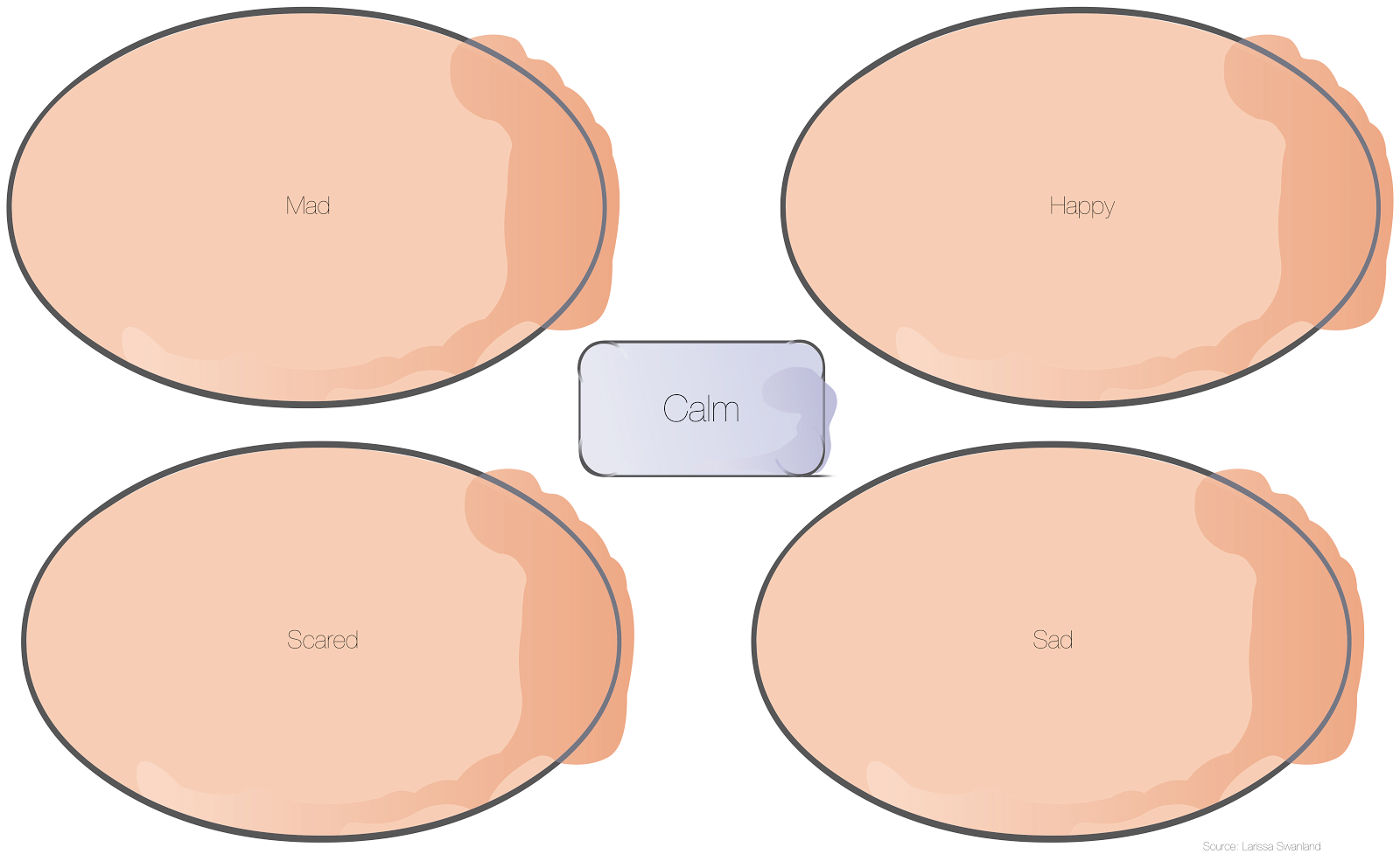
To understand this, we need to have an idea of basic emotional states.
 |
Four basic emotions.
The farther from the center, the more amplified state the emotion is (e.g. the edge of Sad could be seen as depression) |
I can't remember the source, but most emotions fall into four basic categories.
I put calm in as the absence of emotion-- when the dog is in a content or stable state (or just is).
It's here I speculate that personality helps explain how dogs jump to which emotion first, more quickly, how frequently.
Tails:
Face- Expressions/ Ear Position:
Putting it together:
With all of this information, I began to take pictures of Keiko interacting with the world and wanted to test myself to see how well I could read her. Unfortunately I didn't get that many photos of her in moments that she was in extreme discomfort (I think I'd need to have a camera to follow me around).
 |
| I made her pose with her new toy... I felt she was reserved... |
 |
| At the dog park, this was one of the first dogs that Keiko met. |
 |
| she wanted to go home after a while, but this is what she looked like when she was looking for me. |
 |
| She did well here, but didn't like the pointer that was sniffing her on the left. |
 |
| She was ready to go home. She repeatedly came up to me |
 |
| On White Rock Lake, calm and relaxed |
 |
| this was day 3, when she had acknowledged me and was watching my every movement. |
 |
| At White Rock Lake, she kept trying to climb in my lap wanted me to take her home. |
 |
| I taught her how to use PhotoBooth and made her sit on my lap... not amused. |
 |
| getting ready to play with this dog at the Dog-Park |
 |
| every morning, she likes to cuddle before we go for our walk. She could lay here all day. |
 |
| This is Keiko asking me to take her outside |
 |
| checking her territory |
 |
This was one of the first times she went to meet the puppies herself, instead of having them meet her.
|
Any Guesses? :-)
I've now been tracking her emotional reactions to different situations... and getting to know my dog a lot more. Although it hasn't been the instant connection as it was with Britta Bean... I now have no doubt that Keiko and I will continue to bond and I'll get more fluent in Dog-Language :-)


![LaunchPadBaseLayout-[Converted]](http://farm9.staticflickr.com/8112/8601108164_4f91162df6_z.jpg)