So much so that recently, Kenneth, to get me a gift to impress me--got me a neon green iPhone charger.!
Something as mundane, but every day as a phone charger; being my favorite colour was enough to make me smile all day.
 |
| The kiwi green iPhone charger from the wonderful man in my life |
I would have gladly paid an extra few dollars to get a neon green iPhone charger over the standard white one.
The concept that a colour could make all of the difference in a purchasing decision may be lost on some, but I contend that colour choice and appeal is a crucial option decision for any company hoping to market to a broader audience.
The concept that a colour could make all of the difference in a purchasing decision may be lost on some, but I contend that colour choice and appeal is a crucial option decision for any company hoping to market to a broader audience.
Take a look at what apple did in it's comeback with the iBook and iMac!
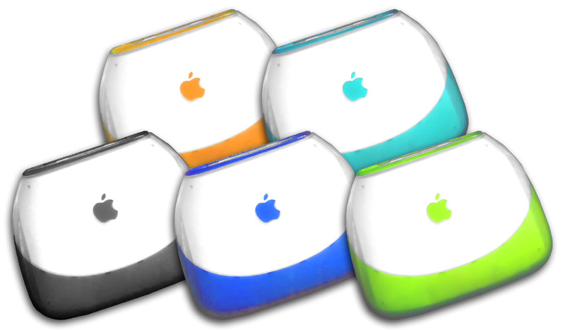
If someone asked me... I would take a lime green ibook any day (even though old and probably slow).
I speculate that,
Colour is the easiest and fastest way for someone to express their individuality/creativity.
After all, if I were to try to appeal to a large audience-- I'd think the fastest way to do so is to allow them to have a say (customise the product).
Maybe a good way to give it a try would be to release a "special edition" of your product...
Example: Xbox releasing the HALO version of the xbox
or Kitchen Aid and all of their stand mixer colour versions.

In my every day job... I work a lot with Microcontroller development boards.

What I work with...
As amazing as the technology is... it's not the presentation people fall in love with.
So if I could have a request for those people who are making these development boards... I wish that colour was a bigger factor in your designs.
ESPECIALLY if you are working on an entry level boards-- that is targeted at someone is being introduced to electronics.
After all, every company releases the standard Green PCB (although I love green, it's really pretty mundane after a while):
 |
| Snapshot of boards from TI's eStore. All standard green. |
Take a look at this to a company called littlebits.cc
It's not that their products are THAT revolutionary, after all there are other products out there that are just as modular, and appeal to the same type of audience (e.g. ModKit). However, what got me hooked and clicking to support was the fact that they had incorporated colours into the overall marketing of their product!
 |
| from littlebits.cc |
Allow people to express themselves by customizing, either through add on functions (like covers, or enclosures) or through offering other colour options.
From a marketing standpoint, use colour to call attention to your products.
For those in my industry--this is particularly important if you actually specialize in being a semiconductor manufacturer-- and releasing development boards to market is a "necessary evil" to get your product out. It's important because the board is essentially the "face" of how you would like someone to perceive the product (chip).
For those in my industry--this is particularly important if you actually specialize in being a semiconductor manufacturer-- and releasing development boards to market is a "necessary evil" to get your product out. It's important because the board is essentially the "face" of how you would like someone to perceive the product (chip).
For example: If everything on the table is either standard pcb green, black or red... go for something exciting like Purple!, or release a special edition of your board ( I bet you'd be surprised by the excitement it brings).
Overall point-- don't underestimate how much lift you can get from giving a few colour options.
I (if anyone is listening).. would like to have a neon green development board next :-)
I (if anyone is listening).. would like to have a neon green development board next :-)
*disclaimer, if your product is simply awful, no colour will really make it any better...
No comments:
Post a Comment